Unit 1
In Unit 1, we covered the informational topics of digital art: history, careers, hardware, software, and intellectual property. All of these topics are important in their own right, but I think that, as someone who is not a history fan, it isn't as important as the others. Learning about careers, hardware, software, and intellectual property can help me in other aspects of my life, but history isn't applicable in many fields.
|
Learning about possible careers in the field allows me to look to the future with a list of what I need to do. Having a job is very necessary when I get out of school, since I need a way to sustain myself. Since I learned about the possible careers I could explore in the field of digital art, I know what I need to do and learn so I can get a job in the field. This is a subject that is purely for moving forward and developing my life further.
|

|
|
Learning about hardware and software is essential if I want to build my own computer or am just curious. Honestly, I'll probably never build my own computer, but it is cool to learn about what goes into certain things. I'm a builder at heart and learning what goes into a computer is fascinating. I'll probably not use all of this information in my life, but it'll show up somewhere unexpected, like a lot of random facts I know.
|

|
|
Finally, learning about intellectual property is probably the most important. Since this deals with the law and since I read fanfiction and have several accounts to do so, this information is relevant, important, and interesting. Learning about the grey legal area that fair use allows is interesting, since it seems like a tricky puzzle, and I love trying to figure them out. Since this also applies to my school assignments, this is also crucial, since I value school a lot and I would rather follow the law while I participate.
|

|
All in all, most of the information I've learned in this unit is important and plays either an interesting or practical role in my life. I really am quite interested in intellectual property, since I have a personal connection and it's interesting. All of the information I've learned this unit is important, but what resonates with me the most is definitely intellectual property.
References
Cagle, Brooke. 3 People with Computers. Unsplash, 27 Mar. 2018, unsplash.com/photos/g1Kr4Ozfoac. Accessed 24 Sept. 2022.
Person Building Computer. Unsplash, 7 Nov. 2020, unsplash.com/photos/sMKUYIasyDM. Accessed 24 Sept. 2022.
Winkler, Markus. Copyright Claim Typewriter. Unsplash, 29 June 2020, unsplash.com/photos/9XfSFjcwGh0. Accessed 24 Sept. 2022.
Person Building Computer. Unsplash, 7 Nov. 2020, unsplash.com/photos/sMKUYIasyDM. Accessed 24 Sept. 2022.
Winkler, Markus. Copyright Claim Typewriter. Unsplash, 29 June 2020, unsplash.com/photos/9XfSFjcwGh0. Accessed 24 Sept. 2022.
Unit 2: Bitmap Graphics
In Unit 2, I started to dive into Photoshop, which is a program that deals with bitmap graphics. Bitmap graphics are images that are made of individual pixels, so when you zoom in, an image becomes pixelated. However, artists can use a technique called anti-aliasing, which allows for the jagged edges of pixels lines to become shaded, so that when you zoom out, the image looks more realistic. Bitmap graphics also come in the common file formats of JPEG, PNG, GIF, and PSD, but there are several others that are used less often. In Photoshop, I used the Interface and Basic and Advanced Editing Tools to create an image of birds on a moose, as explained below.

Photoshop InterfaceAt the very top of the screen, the series of drop-down menus is called the Menu Bar. This contains all of the tools available in Photoshop. Off to the left side, there are the Tools, and right below the Menu Bar are the Tool Options. These show you the tools selected as well as the specific settings of each tool as they are currently. The space in which you work, and in the image above, it is the image of the plains, is called the Active Workspace and is measured by Rulers along the edges of the Workspace. Up in the upper right corner, there is an icon that looks like a battery called Workspace Options. This allows you to reset the workspace settings or otherwise manipulate the settings. The Active Tools Panel in the middle of the right side gives you more specific details on the tool you're using. Below the Active Tools Panel are the Basic Layer Tools, which, in the image above, show the layers on the image and allow you to create layers. Some important tools for using all of these are Zoom, which zooms in and out of the image to get more detail; adjusting the Screen Mode to get the largest Active Workspace as possible; the Hand Tool, which moves the image around on the screen without disrupting the current positions of layers; and the Rotate Tool, which allows you to change the x- and y-axis to get a better angle of the image. All in all, the Photoshop Interface is a lot to take in all at once, but once you get practice, it becomes quite simple.
|
Basic Editing ToolsOne very important piece of basic editing is layering. Using layers allows you to arrange images on top of or behind each other to create the proper effects the image needs. Photoshop also allows you to hide parts of a layer. First, you must select the layer that you want to work with in the Basic Layer Tools area. Then, select the area you want to leave seen with the Lasso tool (<L>), Marquee tool (<M>), or the Magic Wand tool (<W>). There are several other tools that you can use, like the Polygonal Lasso, Magnetic Lasso, Object Selection, and Quick Select. Next, press <Q> for the Quickmask Tool to allow you to see what will be hidden (the red) and what will be left. If the red is on the area you want to leave in the image, hit <Ctrl> + <Shift> + <I> to select the inverse of the selected area, which will switch the red and the clear areas. Now, you can use the Brush tool (<B> is the keyboard shortcut) to refine the area you want to be seen. Using Black adds to the hidden area and White subtracts from the hidden area. Once you are satisfied with what you want to leave hidden, you then hit the Layer Mask Button to finalize the layer mask. Since this isn't destructive editing, however, you can select the layer mask and continue to edit with the Brush tool. In summary, layers are the most crucial tool in Photoshop, since they can make the huge difference in between a professional image and a clearly novice-made image.

|
Advanced Editing Tools

|
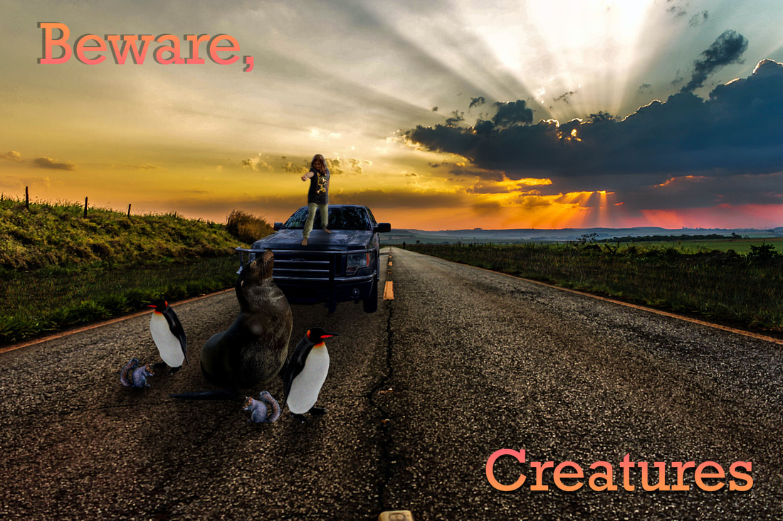
In Photoshop, there are three main ways to adjust a layer. The first way is by using an adjustment or fill layer. An adjustment layer affects all the layers below it, while a fill layer only affects the layer selected and fill it with a pattern. An adjustment layer colors the selected area and does not permanently change the pixel values, allowing you to go back and edit the layer. I used Brightness/Contrast and Levels adjustment layers on the Beware, Creatures image to make the animals like they belong in the picture. The second way to adjust a layer is to apply a filter, which is a destructive editing technique. Filters can affect one layer or the entire image and drastically change the image as a whole. Examples include the Gaussian Blur, which blurs the layer selected, and adding Noise to a layer, both of which were done to the Beware, Creatures image. The third way to adjust a layer is to use a Blend Mode, which combines the colors in the layer. There are six different categories of Blend Modes: Normal, Darken, Lighten, Contrast, Comparative, and Color. All of these labels are rather self-explanatory in what they cover in their categories. These Blend Modes can be especially helpful when adding color to a Black and White image, which is shown in the Balloon image, since I used a variety of Blend Modes to make the color look as realistic as possible. All in all, these three ways to drastically change a layer can make your image become that much closer to looking realistic and build your understanding of advanced Photoshop tools.
|
|
The various Photoshop tools I now know how to use are very helpful when creating images. These will allow me to create more efficiently and better than I could before, and can allow me to have an interesting art skill, which could be helpful, as I do ceramics in class and it could help me come up with cool designs. It could also help me to create for fun and be a good thing to put on resumes once I get a certification. All in all, Photoshop has a huge variety of tools that allow me to change images in so many interesting ways that, when combined correctly, can create a beautiful end product like the one to the right.
|

|
References
Bourgeois, Robert. "Advanced Bitmap Techniques/Tools." Canvas, chccs.instructure.com/courses/38304/pages/advanced-bitmap-techniques-slash-tools?module_item_id=289820. Accessed 27 Oct. 2022.
---. "Basic Bitmap Techniques/Tools." Canvas, chccs.instructure.com/courses/38304/pages/basic-bitmap-techniques-slash-tools?module_item_id=289821. Accessed 26 Oct. 2022.
---. "Bitmap vs. Vector Graphics." Canvas, 22 Sept. 2022, chccs.instructure.com/courses/38304/pages/bitmap-vs-vector-graphics?module_item_id=272322. Accessed 24 Oct. 2022.
---. "Navigating the Photoshop Interface." Canvas, 27 Sept. 2022, chccs.instructure.com/courses/38304/pages/navigating-the-photoshop-interface?module_item_id=272323. Accessed 26 Oct. 2022.
Unit 2: Artistic Techniques
In this part of Unit 2, we covered several different basic artistic techniques. We looked at the elements and principles of design, had a focus on color theory, and then saw how it all tied together with the composition of a piece. We also covered the production pipeline in this unit so that we could have a better grasp of how artists make games. Video games take composition to a whole other level, since they have so many different scenes to consider.
Production Pipeline
The production pipeline has 3 stages: pre-production, production, and post-production. Pre-production includes brainstorming, storyboarding, prototyping, and planning. Generally, this is the ideas stage of the process in which the concepts and practicalities of the project tie together. Production comes next with exactly what it sounds like: the making of the project. For video games, this includes the creation of the coding, characters, and dialogue. Finally, there is post-production. This is when advertising starts and the final debugging of the game happens. This is also when the game is released. All in all, this pipeline is what happens during the production of any large product, like a video game.
|
Elements of Design
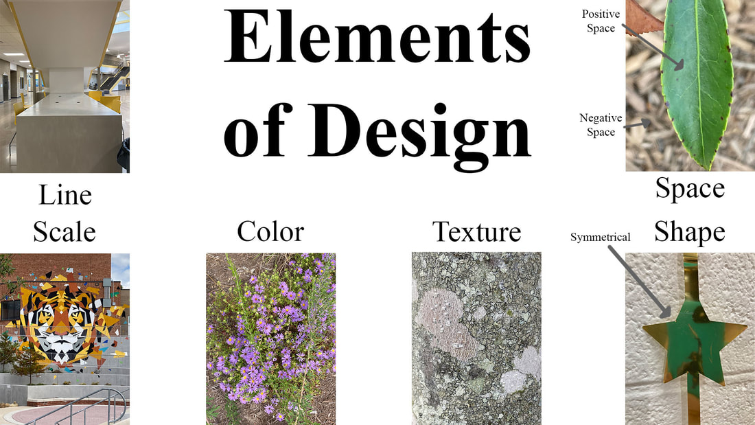
The elements of design consist of line, scale, color, texture, shape, and space. Line refers to a line connecting two points, but it does not have to be straight. Scale refers to the size of the object in comparison to other objects in the image. In the image to the right, the giant tiger mural is seen as huge by the windows and doors near it that seem small. The next element is color, which is just the colors in an image. Texture is the visual feel of an object in an image, like rough or smooth. Shape refers to the shapes in the image, geometric or other shapes. In the image, there is a star with a rectangle halfway in it from the reflection of my phone taking the picture. Finally, there is space. This refers to the focus of the image being in positive space and the rest of it being in negative space. This can be boiled down to the foreground versus the background. These elements work together to make the principles of design.
|
|
|
Principles of Design
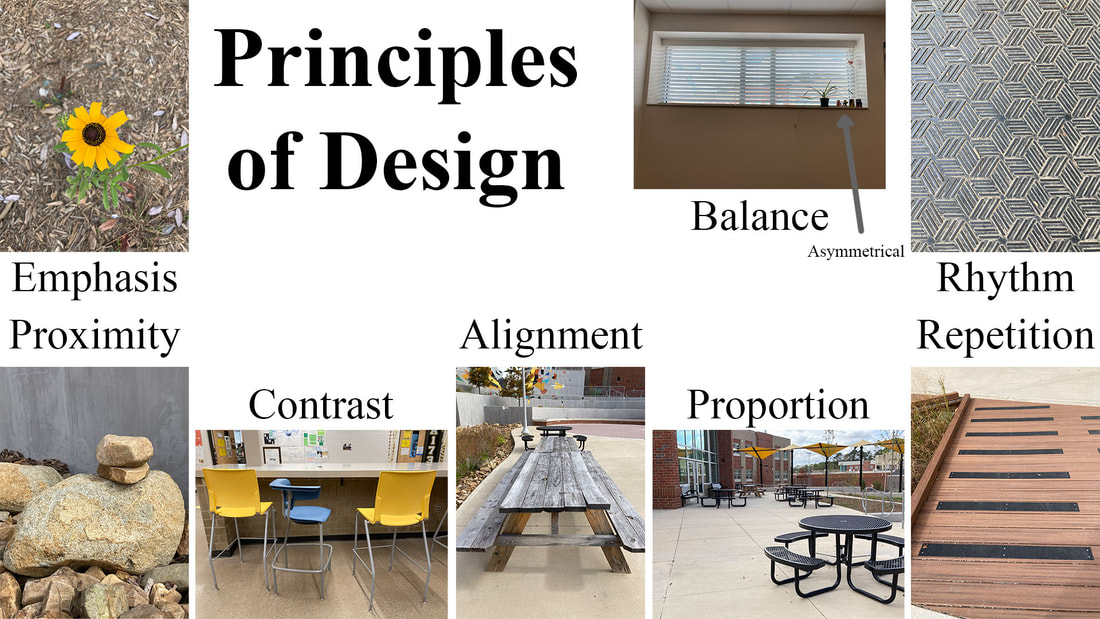
The principles of design are divided into four categories: Contrast, Repetition, Alignment, and Proximity. Contrast makes objects pop by using opposing elements, like positive versus negative space or complimentary colors. It also includes emphasis, as contrast emphasizes an object. Proportion is also included in this, since it is the size of objects that oppose each other, creating contrast. Repetition is exactly what it sounds like: a repeating object in an image. This includes rhythm, which makes a pattern that moves the eye along the image. Alignment is the lining up of objects to create a visual connection. In the image to the left, the picnic tables under Alignment line up in the middle of the image and continue on to another table. Alignment also includes balance, which means the symmetry in an image, be it symmetrical or asymmetrical. Finally, there is proximity, which is how close objects are to each other. This creates a sense of connection between the objects in question. These principles of design work together to help the overall composition in a piece.
|
|
Color Theory
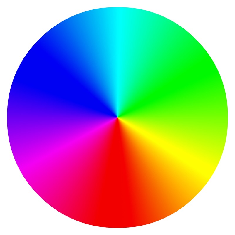
We covered color theory as well. Essentially, we went over different color schemes, like monochromatic, analogous, complimentary, and more. Monochromatic color schemes include different values of one color, so a color scheme with only blues would be monochromatic. An analogous color scheme contains colors close to each other on the color wheel, like red, magenta, and purple. A complimentary color scheme has colors that are opposites of each other on the color wheel, like green and red. A split complimentary color scheme is similar to a complimentary color scheme, but one color is split into the colors next to it, like cyan, magenta, and red-orange. A double complimentary color scheme has two pairs of complimentary color schemes, like red, green, blue, and orange. In any complimentary color scheme, one color is always dominant and uses the opposite colors to emphasize parts of the image. Another color scheme is triadic, which is one in which a triangle is made out of the colors on the color wheel, like blue, yellow, and red. These color schemes help tie designs together and create unity in a piece.
|
|
Composition
Composition refers to the organization of a piece. There are four main techniques when it comes to organizing the image, though there are others. Firstly, the rule of thirds is a technique in which an imaginary 3 by 3 grid is placed on the image. Placing objects on the intersections and the gridlines makes the object stand out as a focus of the image. Another rule is the rule of odds. This means that there are an odd number of subjects or groups of subjects, usually 3 or 5. In the image below, I included three kittens to fulfill this rule on composition. Thirdly, simplification is the removal of objects in the image that are not necessary. This makes it easier to focus on the important aspects of an image. Finally, perspective shows the relationships between objects in the image. All lines go towards a vanishing point(s), and this is how we see the world around us. All in all, these four main composition techniques allow an artist to organize their image cleanly.

In summary, these artistic techniques that I learned in this unit helped me apply my Photoshop skills better and are good things to know when going into an artistic field like ceramics. I now know how the elements and principles of design contribute to form the overall composition of an image. I also know how color theory works, which I thought was the most interesting because I quite like colors. Finally, we also learned about the production pipeline, which was applicable but not interesting. All in all, this unit had helpful tips for me going forward into a potential ceramicist career or hobby.
Citations
Linforth, Pete. “Color Wheel.” Pixabay, 17 Oct. 2016, https://pixabay.com/illustrations/colour-wheel-spectrum-rainbow-1740381/. Accessed 1 Dec. 2022.
Unit 2: Vector Graphics
Vector graphics are made of mathematical equations to form lines called paths. These paths are controlled through the use of anchor points with handles that change the direction the path goes. They are resolution-independent, which means that no matter how close you zoom in, the paths will not become pixels like bitmap graphics. However, the colors are restricted to solid colors and gradients, so they result on more cartoony images. Vector graphics are most commonly used in logos, fonts, animations, ads, infographics, and merchandise. However, vector graphics use files that are not as common as bitmap images, so they are used less often even though they have a smaller file size.
Illustrator Interface

Adobe Illustrator is one of the most common vector graphic image creators. It is actually quite similar to Adobe Photoshop in the way its interface is laid out. However, the canvas in Photoshop becomes the artboard in Illustrator. The artboard can be shifted in size very easily using the Artboard Tool and more artboards can be created with this tool. Otherwise, it's the same. All the tools can be found in the Menu Bar at the very top of the screen. The Tools area is off to left. Unlike Photoshop, you can switch between a Basic and Advanced toolbar under the Window tab. In the image below, the Advanced toolbar is shown as it offers more tools. Off to the right, there are the Property, Layer, and Library menus. The Property menu displays the traits of the object(s) you have selected with the Selection Tool, which is the replacement to the Move Tool in Photoshop. The Layer menu displays all of the objects in the image and organizes which objects appear on top of other objects. Finally, the Library menu allows you to access libraries made from other Adobe applications.

Advanced Tools
The Pen Tool is my favorite tool in Illustrator. I can make whatever shapes I want with it. To the right, the tree trunk and branches were made with the Pen Tool and the Shapebuilder Tool. I love this tool so much because it has so much freedom. This tool directly lets you choose where the anchor points in the shape go and where the handles point. Another fun thing in Illustrator are the effects available. You can change the shape or add a Drop Shadow, as well as many other effects that are available. The Inner and Outer Glow effects are interesting, since that makes a gradient based on the path the shape has instead of based on a line or point within the shape (that is done with the Gradient Tool). The Mesh Tool also allows you to add gradients to a shape by creating a mesh and using the Direct Selection Tool to add other colors into the shape. This allows you to add highlights and shadows to objects, which can make shapes seem more realistic or provide where the light is coming from in a piece. Finally, you can make symbols in Illustrator to repeat common shapes and reduce the file size. I always forget about these, so I never really use these much, unfortunately.
|
Basic Tools
As mentioned above, the Selection Tool is like the Move Tool in Photoshop. It allows you to move shapes on and off the artboard and change the rotation and size of the object. There is also a Direct Selection Tool that allows you to move the anchor points and handles within shapes. This allows you to change shapes from the standardized rectangle and ellipse to more complex shapes. The basic shapes can be made with the Rectangle Tool and the Ellipse Tool. There is also a tool called the Polygon Tool that allows you to make any polygon once you enter the amount of sides. In the image to the left, the background was created through the use of a darker blue rectangle with lighter blue triangles made with the Polygon Tool and changed with the Direct Selection Tool. Another tool that I found to be super helpful was the Shapebuilder Tool. This tool allows you to change shapes based on other shapes around it. I mainly used this tool to delete extra segments in shapes. For the lighter blue triangles above in the background, I used the Shapebuilder Tool to make them line up with the rectangle behind them. Finally, the last basic tool is the Type Tool. As the name suggests, this allows you to type on the artboard. You can type on a path, like the triangles made of text above. You can also type within in area, like the explanation in the graphic above. Editing certain letters is an option too. You can make them larger or smaller, change their color, and anything else available. Finally, you can also type vertically using the Vertical Type Tool, as seen by the "Luminari" above.

|
All in all, the vector graphics that you can create in Illustrator are versatile. Once you make a shape, you can constantly go back and change it until it is exactly the way you want it to be. As someone who likes to randomly sketch every now and then, this is nice because I can be a perfectionist without having to constantly erase lines. In fact, the tree above is something I have drawn multiple times. This is also a nice area to conceptualize art ideas before putting them on ceramic pieces since I can create shapes more easily than I can in Photoshop. Illustrator is definitely my favorite program I've used this year, but since I've only used two, that really isn't saying much.
Unit 3: Audio/Video
Premiere Pro is a video and audio editing software that allows you to create your own videos. In this unit, we used Premiere Pro to create several videos. I learned how to use Premiere Pro, as well as more advanced tools in the software. I also learned the rules of shooting and various cuts and transitions used when making video.
Premiere Pro Interface

The Premiere Pro interface has several different workspaces. There is a dropdown menu in the upper right corner to change the workspace. In the image to the right, the Editing Workspace is open. This workspace has a Project Panel, Source Panel, the Timeline, and a Preview Area. You can also click over to other panels to find Effects and Effects Controls. Effects Controls is a handy panel because you can animate items with it. You can create keyframes based on position and scale to create an animation of a title or a Lower Third. The Effects Panel is nice because you can add effects to your content. These can apply to audio and video and can make the transition between clips easier. You can also add an adjustment layer to the whole video and apply an effect to that to change the whole video. Two other important workspaces are the Audio and the Captions and Graphics workspaces. The Audio Workspace allows you to label your audio and efficiently duck your audio, as well as other audio techniques. These are helpful because you can specifically choose to duck against dialogue, which allows the background music to fade in and out without minutes wasted of carefully selecting points to change the audio with. Finally, the Captions and Graphics Workspace allows you to edit and layer your text and graphics you have created. You can pin them to each other so that they stay together while being animated. You can also Roll credits at the end by selecting a box and letting them scroll through the screen. Another thing you can do in this workspace is create subtitles. You first select the button to create a transcription and then go over the text to make sure it is actually correct and not some amalgamation of words. I have gotten one that says, "58% of students believe that sanitation into severe you grade with brown permit." This is not anything near what I meant to say. Another one said, "the best care at Japanese high school is brown with great cement." These are both comedy gold and also so irritating because you have no clue what it actually means.
Basic Cuts & Transitions
|
A Standard (or Hard) Cut, L and J Cuts, Cuts on Action, and a Jump Cut are a few examples of basic cuts. A Standard Cut has no transition and just changes to the next clip. In the video to the right, a Standard Cut is used at the end when rapidly shifting in between the clips to make it more jarring. However, a Jump Cut has no transition, but it jumps in between parts of a clip or between camera angles of the same item. Cuts on Action match the amount of action happening between scenes to make the cut easier to watch. An L Cut is a cut where the audio from one clip carries onto the next clip, while the J Cut has the audio from second clip start during the first clip and talk over both clips. The four most common transitions are the Fade, Dissolve, Iris, and Wipe. The Fade takes a basic color and the video is either faded in by a color or faded out to a color. The Dissolve changes between two clips by slowly replacing one clip with the other. The video to the right uses this in the beginning portion to make the transition between clips easier. The Iris is when a shape is used to close off one clip and is normally only used in cartoons. Finally, the Wipe shoves one clip off the screen with another clip.
|
|
Rules of Shooting
One really common technique is the shot reverse shot. This technique shows the action that the person is looking at and then the next shot is of the person reacting to the action. Another rule is the 180 Degree Rule. This rule draws a line between interacting subjects and states that filming should only occur on one side of the line. Using shots from both sides of the line creates confusion. Head Room is the rule that states that you should leave a little bit of space between the top of the head and the top of the frame and also that you should avoid leaving no room below the chin. Also, if a subject is moving, you need to add Lead Room in the direction that they are walking so that the clip doesn't feel too cramped. Like Unit 2, the Rule of Thirds applies here too. This makes subjects easier to focus on. Finally, one rule for fluidity is the 45 Degree Rule. This ensures that the shots don't appear like a Jump Cut by having at least 45 degrees between the angles of consecutive shots.
All in all, this unit was fun but annoying. Since Premiere Pro doesn't allow you to work on projects with multiple computers easily, it was really annoying to only work on one computer for each project. However, I definitely learned a lot about how to film video and to make a finished video. I also learned about Premiere Pro's layout, basic cuts and transitions, and other techniques within Premiere Pro. This could help me with probably absolutely nothing in the future, but it was cool to learn and I had a lot of fun screwing around with video.
Unit 4: Animation
Over the course of history, animation has evolved from rotating images to the animation you see today. It originated as a spinning disk called a Thaumatrope in 1824, which then evolved into the Phenakistoscope in 1829 and the Zoetrope in 1833, both of which are spinning wheels with images that progress through the rotation. Animation evolved until Gertie the Dinosaur was drawn into existence in 1914. This was the first frame-by-frame animation ever made. Syncing sound with animations came around in 1928 with the release of Steamboat Willie. In the 1930s, color and multiplane cameras were introduced. Animation continued to evolve as industries began to spring up around animation, especially once the television became popular. Some industries include Walt Disney, Warner Bros, and Pixar.
Principles of Animation
|
There are 12 Principles of Animation. The first one is squash and stretch, which gives the object the illusion of weight and flexibility, like the bouncing ball. The second is anticipation. This one is about the lead up to an action, like bending your knees before jumping. Another principle of animation is staging, which provides the setting in which the scene takes place like the snowy hills with the snowman. Next, there is straight ahead action vs. pose to pose action. Straight ahead action is when the frames of an animation are drawn in order, but pose to pose action is when the poses are drawn and then all the in between frames are created. Computer animation uses pose to pose action when tweening. Another principle of animation is follow through and overlapping action, which is when one part of an object continues to move in the previous direction while the rest of the object changes direction. Slow in and slow out is when an object accelerates at the beginning and end of a movement. For all of those people who don't know the proper physics definition for "accelerate," it means whenever an object's speed changes. Another principle of animation is the arc. This is also based in physics and makes objects seem more natural because they travel in naturally occurring paths, which you can see in the path of the sun with the snowman. Timing also helps make objects seem more natural because they follow plausible timing. Secondary action is when another object is added to emphasize the other object's movement. A fun principle of animation is exaggeration. This is when a small movement is emphasized and made more dramatic. Another principle of animation is appeal, which is essentially just adding personality to a character. Finally, there is solid drawing. This places objects in the 3D plane and makes them seem like they belong in the scene they're in.
|

|
|
Tweening
There are three types of tweens: shape, motion, and classic. All of these tweens require at least one keyframe, or a frame that sets the positions of the objects. A shape tween uses shapes and drawing objects and can move them around and change their shape. This does not do well with detail. Motion tweens and classic tweens require those shapes or drawing objects to be turned into a symbol. These keep their shape the same and can move them around in complex paths. All of the tweens used in the Sheikah Robotics logo are motion tweens because the detail would not stay with a shape tween. Motion tweens can be edited at any point on the tween and those will become keyframes, but classic tweens require two keyframes and two keyframes only. Motion tweens can also be nested, meaning that the tween will repeat over and over again. These types of tweens allow you to move your objects in unique ways around the scene.
|
All in all, Adobe Animate has been interesting to use and learn about. Learning about the principles of animation was interesting because it was applied to cartoons and I could see how each one was done. This knowledge will probably just sit in my brain unless I want to make something interesting or maybe if Robotics needs something animated. However, this unit was fun and I liked working with the program.
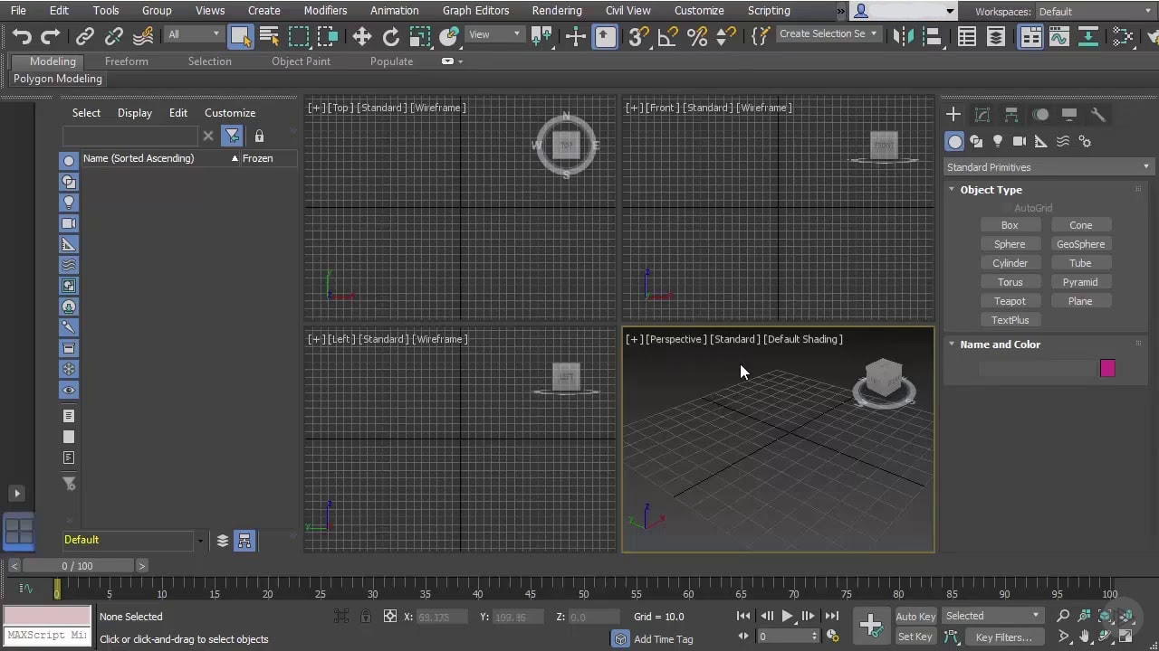
Unit 5: 3D Modeling
|
Unit 5 covered 3D modeling, which is essentially graphing in math class cranked up a few levels. Like in math class, coordinates are used, specifically Cartesian Coordinates. These are the standard X and Y coordinates with an extra third dimension representing height called the Z axis. This allows the computer to create 3D models and rotate around the scene. The interface of 3ds Max is simple to understand once you figure it out. The command panel is on the right side of the screen and lets you create shapes and modify them. On the right side of the interface, there is the list of every object in the file called the scene explorer. Up top, there are the various tools in the toolbar and the menu bar. In the center, there are the viewports. These let you see your object from varying angles, like from the top, left, front, and perspective. You can also look at it from any cameras that have been placed in the scene.
|
|
|
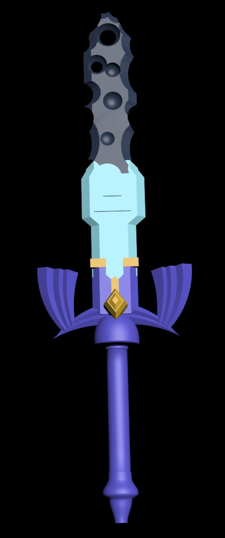
Modeling Basics & Modifiers
To make anything in 3ds Max, you first have to create a shape. This can be anything from a spline to a torus. In box modeling, you would then arrange these shapes in the way that you intend for them to be viewed. You can create trees with a simple cone stacked on a cylinder or make an igloo out of spheres. There is also surface modeling, which is when you take a shape and change its shape. This is done through the Edit Poly modifier under the Modify tab. This modifier lets you alter the surface of an object through either the vectors, edges, faces, or borders of an object. In the Decayed Master Sword image to the right, the sword gets wider near the base because I selected certain faces and pulled them outward. Another tool you can use is the Boolean or ProBoolean under the create tab. These let you create shapes out of multiple primitives by either combining them, taking one shape out of the other, or making a shape out of the overlap. This is how I put the Triforce onto the blade of the Decayed Master Sword. Another interesting tool is the Loft tool. This tool lets you take splines that you have made and project them along a path, which is how I made the hilt of the Decayed Master Sword. There are also many other modifiers that are available to use. Some of the more common ones that are used are Bend, which bends an object on a certain axis, and Taper, which narrows or widens one end of an object. To create the wing guard for the Decayed Master Sword, I made boxes, used Taper on them, and then bent them to the right angle.
|
Lights, Cameras, & Animation
|
To make a scene in 3ds Max more realistic, you can add lights to it. These lights can just be lights that come from a certain place that point nowhere in particular or they can be lights with a target and the light will point at the target. Cameras can also be added to make a rendered animation more interesting by changing the point of view of the render. Cameras can also have a target and can follow objects throughout the scene. They can also be linked to moving objects and follow them around the scene. Finally, to make an animation in 3ds Max, you can create keyframes along the timeline to change an object's positions, colors, and other properties. You can simulate the rising of the sun within a scene or the night falling upon it.
|
|
In summary, 3ds Max can be used to create 3D scenes in a variety of ways. The only reason I'd probably ever use it again would be to make more Legend of Zelda art, but I still thought it was really interesting. However, my Robotics team uses a different 3D modeling program called Onshape to create the model of the robot. This is really important, since it allows us to 3D print objects and CNC parts, which really lets us create the specific shapes we need in our designs. I really loved using this program overall.
